
‘He can’t be a man cos he doesn’t smoke the same cigarettes as me,’ mocked Mick Jagger on ‘(I Can’t Get No) Satisfaction’ in 1965. And he was right. Back then, and for some time afterwards, the brand of cigarettes you chose said a lot about you. Well, to start with, the fact that you smoked at all said something: Keith Richards smoked, Cliff Richard did not.
Brands were soaked in cultural and social significance. Someone who smoked Dunhill, say, was the kind of person who’d have a desk-lighter, while someone who smoked Embassy was unlikely to have a desk. The connotations were nothing to do with the actual product, of course. There were different flavours available, but the taste didn’t mean anything in itself. The associations built up around a cigarette were entirely down to the packaging and the advertising.
None of this matters anymore. The adverts have gone, and so too the old designs. I’m very happy to accept that the War on Tobacco has been a Good Thing, but it doesn’t stop me feeling a little twinge of nostalgia – not necessarily for the best cigarettes, but certainly for the ones that meant something to me.
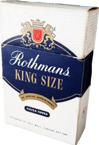
Rothman’s King Size
The first cigarette I ever smoked, back in the summer of 1977, was a Rothman.
At the time, more than 40 per cent of the adult population smoked, despite a government health warning on every pack: ‘Cigarettes can seriously damage your health.’ (The word ‘seriously’ had been added in March that year, on the instruction of Labour health secretary David Ennals.) Packets also carried an indication of how strong the brand was, following the introduction in 1973 of a league table showing tar and nicotine content. Rothmans were categorised as Middle Tar, with 17 mg of tar per cigarette.
I didn’t think much of that first cigarette, and I never took to Rothmans. As I quickly realised, they had a dodgy image as well. The blue-and-white packaging – all smart, clean lines, with the hint of a blazer-badge – had aspirations to yacht-club membership, but really belonged in the saloon bar of a suburban public house that self-consciously called itself a tavern. Nonetheless, the taste stayed with me; even twenty years on, a drag on a Rothman could take me back to that summer.
In 1977 a packet of twenty Rothmans King Size cost 48p, and the Bank of England inflation calculator says that the equivalent today would be £2.63; but the Bank of England doesn’t live in the real world, where a pack will set you back £10.90.

Old Holborn
Rather than sticking with Rothmans, I learnt how to roll my own, a simple skill that pleasingly expanded the ritual of smoking. For tobacco, there were only two real alternatives here. Characteristically of the times – for the 1970s weren’t big on consumer choice or quality – neither was particularly good. Golden Virginia, with a 50-per-cent share, and Old Holborn, with 41 per cent, dominated the tobacco market in the same way that the likes of Watneys and Whitbread dominated beer.
I went with Old Holborn, which was darker and had more depth in its flavour, but it wasn’t something to be dogmatic about, because there was no image difference between them. Partly that was because a roll-up was already so distinct from a ‘straight’ cigarette (as it was then expressed) that differences between brands mattered far less. Also, both the leading brands came in half-ounce blocks, wrapped in silver foil; it was a much smaller canvas than that offered by a pack of twenty, and the designs were less striking as a consequence. And then there was the fact that the packaging began to lose its structural integrity after the first half-dozen smokes, collapsing into a crumpled fold of paper that leaked straggly clumps of tobacco.
The other choices weren’t available in every shop, but could be found if you looked around. I had a phase of favouring Three Castles, which, like Golden Virginia, was made by W.D. & H.O. Wills of Bristol. This wasn’t sold in blocks, but in one-ounce pouches – which were bigger and didn’t disintegrate – and it was pleasingly old-fashioned in its presentation, with a pastel colour scheme and a font that rendered the name as Three Caftles. Unfortunately, it wasn’t very nice: an even thinner and hotter smoke than Golden Virginia. But I was attached to the image, and for a while that was sufficient.
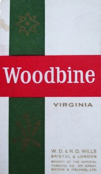
Woodbine
Pursuing the retro theme, I had by 1979 acquired a great fondness for Woodbines, another Wills brand.
The standard format for cigarettes was a packet of twenty, but most of the popular brands also had a Mini-Me version in the form of a pack of ten. These seldom looked right, because with king-size cigarettes, the narrow box was out of proportion with itself. But Woodbines were perfect for the smaller package. They were short and thin, and – unlike upwardly mobile brands such as Rothmans, which had a packet with a flip-lid – they still came in the old structure of a little tray inside an outer casing that you pushed up from the bottom. The box decoration had once been all fancy and floral, back when they were known as Woodbine Wilds, but now it was blunt, no-frills, functional, just like the cigarette. Despite all the limitations of Woodbines, however, they had a certain attitude and style and, being unfiltered, delivered a rapid, strong hit. They were the distilled essence of the cigarette, the Ramones of smoking.
They’re fixed in my mind in the 1930s. George Bowling, the middle-aged insurance salesman in George Orwell’s novel Coming Up for Air (1939), smoked Woodbines, and I’d be prepared to bet that Orwell did too. (Orwell also created the most famous fictional brand with Victory cigarettes in Nineteen Eighty-Four. I would’ve smoked those if someone had had the imagination to market them.)
But the Woodbine appears elsewhere in literature as well. In E.M. Forster’s Howard’s End (1910), Leonard Bast, the unfortunate little clerk with aspirations above his station, smokes them, and so does the anti-hero of Ted Lewis’s Jack’s Return Home (1970, filmed as Get Carter), the latter showing that he’s still loyal to his working-class roots. When Brian Epstein was cleaning up the image of the Beatles, he stopped them smoking Woodbines: not classless enough for the world of mainstream entertainment.
In exactly the same format – and tasting pretty much the same as well – were Weights, made by John Player. They had none of the cultural presence, and they were even more of an old man’s cigarette, so uncool that surely only a very cool young man would smoke them. A bit like wearing fingerless woollen gloves (good for smoking, as it happens). David Bowie said the first cigarettes he smoked were Weights, nicked from his dad, which makes the point.

Player’s Navy Cut
In 1979-80 I worked for the British Army in West Germany. One of the benefits we enjoyed was the right to shop in the Naafi supermarket, where tobacco and alcohol were duty-free. To deliver us from the temptation to buy large quantities and sell them on at a profit, we were issued with ration cards, restricting the amount we could purchase each week. Not everything was rationed. Spirits were, but not wine, since wine wasn’t that big with soldiers and their families. Cigarettes very definitely were; we were permitted 200 a week, as I recall (and there were those in the Sergeants’ Mess for whom that wasn’t nearly enough).
Prices were so low that, for the first and only time in my smoking life, I could buy at the top end. Regrettably, this being the army, that didn’t mean the sophisticated brands: the Naafi didn’t sell Sobranie Black Russians, nor Fribourg & Treyer Number One, let alone the Sullivans so beloved of A.J. Raffles. But I could at least afford a stronger smoke, one that fell into the government’s Middle-High Tar category, specifically Navy Cut, which had 26 mg of tar per cigarette. The official name was Player’s Medium Navy Cut, the ‘Medium’ implying a ‘High’ that didn’t exist; there was though Capstan Full Strength from Wills, which – at 38 mg of tar per cigarette – was the strongest available from normal shops.
As an alternative, I’d sometimes buy Senior Service, made by Gallaher, home of Old Holborn. Both these brands traded on maritime imagery to complement the names. Senior Service had a fine old sailing ship on the box, but Navy Cut went one better and had a fine old sailor – bearded, capped, a ship to either side of him, all inside a double-circle of rope. That gave it the edge for me. As cigarettes, the two brands were too strong to be distinct in flavour, in the same way that high-strength lagers taste the same. And like those lagers, there was a sticky sweetness to the strength. Too damn strong, though. You’d get sea-sick smoking them on a boat.

Roth-Händle
I never got the hang of West German cigarettes. They tasted different to British ones, they were all virtually identical, and I didn’t understand the cultural weight of any of it (except that German punks didn’t seem to like Marlboro, seeing them as akin to McDonalds, a symbol of Yankee imperialism). The big national brand was HB – which was actually made by British American Tobacco – with a logo like two Dairylea cheese slices, a red one superimposed on a yellow one. A perfectly nice design, but not a whiff of glamour; it could have been the packaging on a crispbread.
There was also a different attitude towards menthol cigarettes, or so it seemed to me. In Britain, menthol brands such as St Moritz and Consulate were strictly for women (middle-class and lower-middle-class respectively). Or else they were the preserve of the artistic poseur: normal cigarettes had cork-coloured filters, while menthols were often white all the way down, which made them a good look for someone wearing a crumpled linen suit – as long as that person was Bryan Ferry. In Germany, on the other hand, menthols were everywhere: even the SPD chancellor Helmut Schmidt smoked them.
The one exception to German taste that I found, the only local smoke I liked, was Roth-Händle. They came in a soft-pack, which required you to tear off a bit of foil at the top to get at the cigarettes, and then flick the bottom to pop a cigarette up. The package was oddly primitive; a red background with a drawing of a hand and a motley mix of typefaces, it had the atmosphere of a 19th-century hand-bill. They were untipped and boasted of not using as many additives as others; consequently, they were a bit rough, and seemed to be almost as strong as Navy Cut. Not now, though: European Union regulations forbid anything over 10 mg of tar per cigarette.
German cigarettes never made it to Britain, but French ones did. Gauloises Caporal and Gauloises Disque Bleu were very fashionable in certain arty circles. Even more so, Gitanes, with their logo of a gypsy dancer wreathed in smoke. These were the very epitome of alternative sophistication. Jean-Paul Sartre used to smoke Gitanes, we understood, but more relevantly so did David Bowie. And Paul Weller in his Style Council days, and Slash from Guns n’ Roses, who got a tattoo of the logo. Not me, though. I could see the conspicuously cool appeal, but they were an acquired taste that I never acquired.
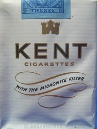
Kent
In any event, I didn’t look to France for style. Real rock ‘n’ roll smokes had to be American. But not Marlboro, which – the German punks were right – were far too corporate. Admittedly, Keith Richards and Johnny Rotten smoked them, but it was surely no coincidence that Bowie switched to Marlboro in the 1980s, and his music nosedived at the same time; inspiration didn’t flow like it did in l’Age des Gitanes. Camels were okay, because the logo was so idiosyncratic, because they tasted good, and because they’d sponsored Alan Freed on US radio in the 1950s. Better yet were Lucky Strike, because a packet was on the cover of the first New York Dolls album, and that was the greatest band photo ever.
My own favourite, though, was Kent, which came in a white soft-pack with plain lettering except for a flourish that proclaimed: ‘With the micronite filter.’ That meant nothing to me at the time, but it stems from 1952 when Kent first popularised tipped cigarettes in America. (I was told later that the original filters were made from asbestos, which wasn’t much of a win.) In Britain, they fell into the Low to Middle category – 16 mg of tar per cigarette – and were very smooth, something of a relief after the coarse aggressiveness of Navy Cut. But what attracted me, as ever, was not the smoke itself but the fact that they came with a celebrity endorsement, in this instance from Robert Gordon.
In case you’ve forgotten him, Gordon had been part of the early CBGB’s scene in New York, singing with the band Tuff Darts, but he jumped the punk ship early on and in 1977 released a fabulous old-school rock ‘n’ roll album in collaboration with Link Wray. He revelled in period imagery, releasing a 12”-single of Sanford Clark’s ‘The Fool’ that played at 78 rpm, and came in a plain brown sleeve with the price marked at 15/-. Clearly, this man knew his stuff, and when he said that he smoked Kent as a retro 1950s cigarette, that was good enough for me.

I expect Robert Gordon also used a Zippo lighter. I didn’t. The flip-lid made for a neat movement, adding to the ceremonial, but the things stank of petrol, and made the first couple of drags taste of it. Anyway, the imagery was rooted in Hell’s Angels, and I was never going to pull that off. I liked safety matches, England’s Glory by Bryant & May for preference. They had a joke on the back of the box, and were nicely old-fashioned. Eventually, Zippos and matches both got driven out by the advent of cheap disposable lighters, though England’s Glory still survive; they’re made in Sweden now.
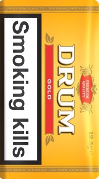
Drum Gold
What’s coming through, I hope, is the sheer stupidity of much of my smoking life. Not simply that I smoked at all, but in the use of brands as statements of identity. My only defence is that I wasn’t alone in falling for this stuff. ‘Illustrations really move me into buying cigarettes more than anything else,’ said Bowie. The marketing was very effective.
But it didn’t last. Cigarette adverts were banned on television in 1965, on radio in 1978, in cinemas in 1986. In retrospect, it’s a wonder how long the process took, and some couldn’t wait: Radio Times unilaterally banished cigarette adverts from its pages in 1969. Then, in 1997, Tony Blair’s Labour Party was elected on a manifesto that proclaimed: ‘Smoking is the greatest single cause of preventable illness and premature death in the UK. We will therefore ban tobacco advertising.’ Admittedly, there was that tricky business about Formula 1 to navigate, but advertising and sponsorship did eventually come to an end.
Along the way, the warning notices on the packets got bigger and blunter: ‘Smoking kills’ was the most direct of all. (‘That’s just rude,’ as a waitress in a Chicago diner observed in 2003, when she saw my British box of Kent, bought to celebrate my first visit to the States.) Then the unpleasant pictures were introduced, photos of diseased lungs and the like. The amount of space left for design on the packs shrank and shrank, till there was only just room for brand colours. And in 2016 even that ended, with the introduction of standardised packaging regulations. Now they’re all in black livery.
As the visual style of the cigarette was gradually squeezed out of existence, the beneficiaries were those that looked dull to start with. The biggest European contribution to British smoking was not French, but Dutch, with a growing presence in the rolling-tobacco market. In the 1970s, there was Samson, made by Niemeyer, and – although it was a decent smoke, better than Old Holborn or Golden Virginia – it was then only a small player. But by the 1990s its dark-blue pouch had become common. So too had Drum (sometimes Duma) from Douwe Egberts, which had similarly unambitious packaging. The bland uniformity seemed entirely appropriate for the time. I settled for Drum Gold, which shared the same utilitarian design, but came in a better colour. And it was a more pleasant smoke than the blue version.
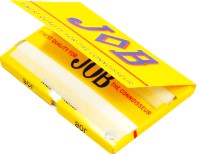
Exempt from the packaging regulations are packets of rolling paper. It’s a bit of shame, therefore, that no one ever made much of this, but then Rizla+ have so much of the market that they don’t need to bother. (Being a pedant, I insist on including the +, since the name is an abbreviation of Riz Lacroix.) I tended to buy Rizla+ in the orange pack; blue was too thin, while green had the corners docked to make them easier to roll, and that was cheating. The liquorice-flavoured version was launched in the 1980s and was an abomination on the face of the earth. The 1990s brought Raw papers, which were a bit butch for my taste. My real favourites were the far more stylish Job, a lovely typeface on a yellow pack that was twice the height of a Rizla+ packet because it had a double row of papers.
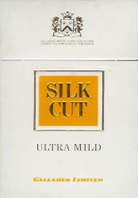
Silk Cut Ultra Mild
Advertising was one front on which the War on Tobacco was fought. The other was the fight to restrict where one could indulge. It used to be, for example, that the second carriage from each end on a London Underground train was a smoking car. Rush-hour on a wet autumn morning, as the doors opened and the steam and smoke billowed out, was a fine sight. But that stopped in 1984, and in 1987, following the King’s Cross fire, smoking was banned throughout the tube network. Around the same time the convention ended of passengers on London buses being allowed to smoke upstairs in the rear seats.
There were similar curbs across the country, while the Newcastle-upon-Tyne Metro, which opened in 1984, was non-smoking from the outset. Some commercial operations took their own action: in 1987 Cannon/ABC became the first chain of cinemas to ban smoking in the auditoriums. (Prior to that, many cinemas had smoking and non-smoking sections, which didn’t really work, since the smoke failed to respect the theoretical borderline.)
We all knew, of course, that smoking was a bad thing. We’d known that from the outset. By the 1990s, for those who wished to continue smoking, there were two directions that could be taken. One was to flaunt the vice, and for this purpose, one might have turned to a brand launched in 1991 called Death, sold in packets that had a skull-and-crossbones logo and carried very big health warnings. (They tried a very long cigarette with a filter at each end, with the idea that you cut it in half, getting two smokes for the tax of one; the Revenue Men were not fooled.) The other option was to reduce the strength of the cigarette one smoked.
I took the latter course, and for a while Silk Cut Yellow were my preference. They were even weaker than regular Silk Cut, but surprisingly flavoursome, and I really liked them. They didn’t last. I always associate the brand with the Sunday Correspondent, a newspaper that I enjoyed a great deal and which folded within fourteen months of its launch in 1989. The lesson I took from that episode was that I probably shouldn’t be anyone’s target market, and the short life of Silk Cut Yellow made the same point. Anyway, once you’re smoking stuff this mild, it’s probably time to knock it on the head.

Times change. I started smoking when it still reeked of glamour, as seen on the album art of David Bowie’s Young Americans (1975) and Marianne Faithfull’s Broken English (1979). By contrast, Drag, k.d. kang’s 1997 tobacco-themed album, had a fabulous photo of her on the front, with the first two fingers of the right hand raised as though smoking, but without an actual cigarette; to depict the real thing, in all its seductive elegance, was now unacceptable. When the Arctic Monkeys released Whatever People Say I Am, That’s What I’m Not (2006) they faced criticism for the cover-photo of a bloke smoking, and defended the picture on the disappointing grounds that it was deliberately unglamorous: ‘You can see from the image, smoking is not doing him the world of good.’

Cigarettes aren’t entirely invisible just yet – people still smoke in the street and at home – but culturally they’ve disappeared. Certainly the days are long gone when comedians, from Dave Allen to Bernard Manning, were permitted to smoke on television. And in 2007 (a year earlier in Scotland) came the big change, with the outlawing of smoking in enclosed public spaces. Pubs, working men’s clubs and bingo halls were adversely affected.
Eventually, even I stopped. I never did get round to smoking a Sullivan (did they still exist?), but I did enjoy a Sobranie Black Russian on the very rare occasion when I could justify the expense – and a very beautiful cigarette it was too, the perfect accompaniment to a pink gin. I don’t miss the Rothmans, though.

My thanks to Simon Clark, John Flaxman and Rae Maile for providing additional information.
Discover more from Lion & Unicorn
Subscribe to get the latest posts sent to your email.

What a brilliant article, I would guess we are a similar age, and this really chimed with me
LikeLike
What a great essay, really chimed with me
LikeLike
Lovely essay! Thank you for this. Reminds me of my own journey. (Much younger than you) – so a bit of an interesting history lesson too! 🙂
LikeLike
Great read… but surely Player’s No. 6 deserved a mention? I assumed they were most people’s introduction to cigarette smoking in the 1970s.
LikeLike